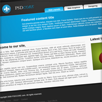
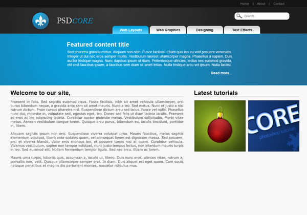
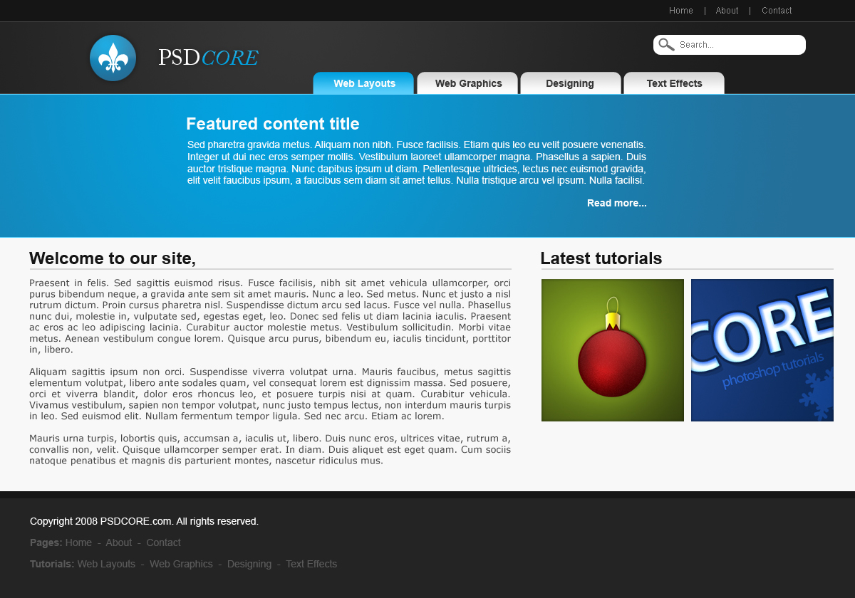
Modern Web 2.0 Web Layout
In this tutorial I am going to teach you how to create a modern web 2.0 styled web layout from scratch.
Step 1
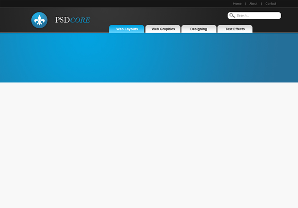
Firstly we need to create a new document, the size I have chosen is 1200 pixels by 840 pixels because it is big enough and when halved it fits nicely on PSDCORE. Fill the background with the colour #f7f7f7.

Step 2
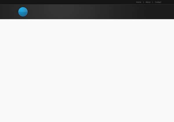
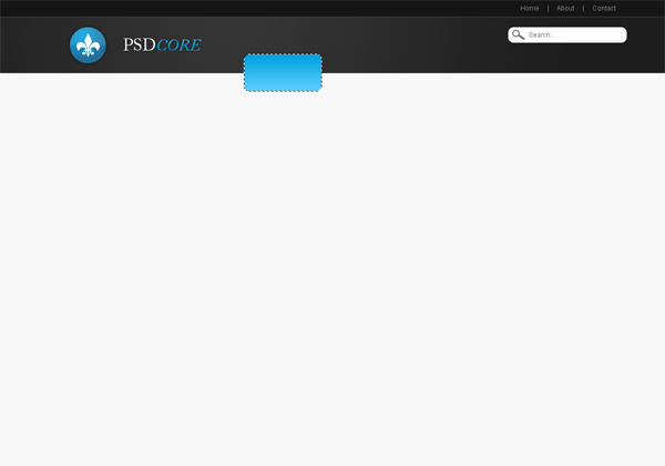
There are going to be quite a number of layers in this tutorial, so I suggest that you label them and sort them into groups. Firstly create a new layer and make a selection of 1200 by 30 pixels at the top of the document and fill with the colour #151515.

Step 3
Using the text tool add in some text links in the top right corner. The font I’ve used is Arial, and the colour #8a8a8a. If you can’t see this text very clearly or other parts of the layout, go down to the bottom and go to the full size view.
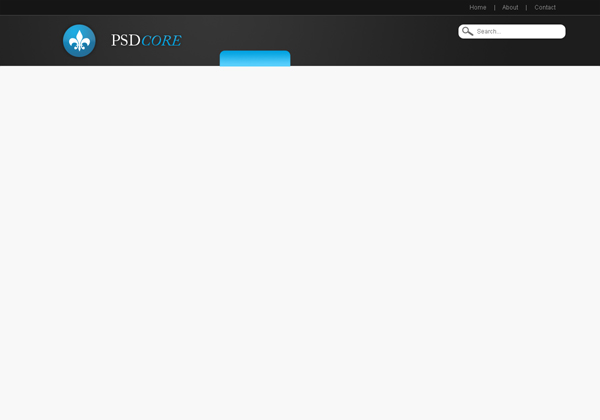
Step 4
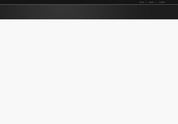
On a new layer make a selection of 1200 by 100 pixels underneath the top (and one pixel down). Fill the selection with a radial gradient using the two colours #353535 and #1d1d1d.
Step 5
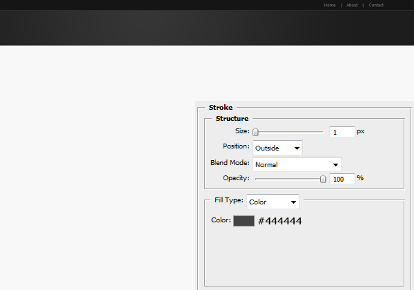
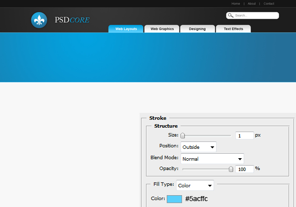
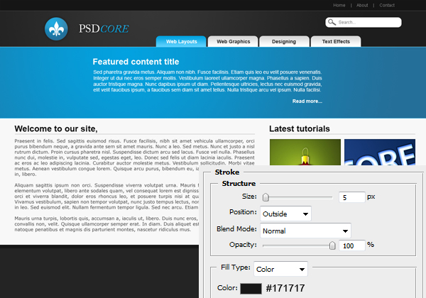
Apply this stroke by going Layer > Layer Style > Stroke.
Step 6
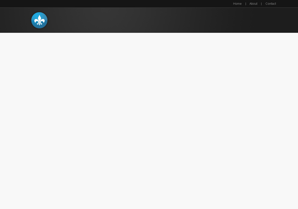
On a new layer add in your logo or just create a simple one. I’ve made a circle with the elliptical marquee tool and filled it with a radial gradient using the two colours #02a2e0 and #246f99. There is also a simple gradient overlay and outer glow.
Using the custom shape tool I’ve also added a little white shape in there.
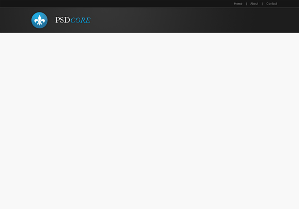
Select the text tool again and type in the name of your site. The font I’ve used is Adobe Caslon Pro and applied the same two layer styles as the logo.
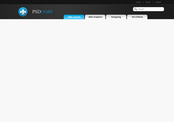
Step 7
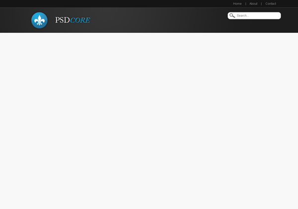
Now we are going to be adding a search box on the right hand side, on a new layer select the rounded rectangle tool and set the radius to 10 pixels. Make a shape (fill colour white – #ffffff) like the one below.

Add some text like ‘Search…’ to the box. The font is Arial and colour #6c6c6c.

Using the custom shape tool again make a magnifying glass icon on the left of the text using the same colour – #6c6c6c.
Step 8
Next up is the navigation buttons for the categories. Create a new layer and select the rounded rectangle tool (still at 10 pixel radius) and make a selection with the two curved corners on the top of the background and the bottom below. Fill this selection with a gradient from #02a2e0 to #5acffc using the gradient tool set to linear.
Select the area of the background behind the logo (Ctrl + Click the layer’s icon) and invert selection (Ctrl + Shift + I) and delete it (delete key on your keyboard). This leaves just the top part of the button – the part we want.
Using the text tool add in some text. The font here is Arial again and the colour is white.

Repeat this process for a button beside it – this time the gradient is from #d7d7d7 to #fcfcfc and the colour of the text is #2f2f2f.
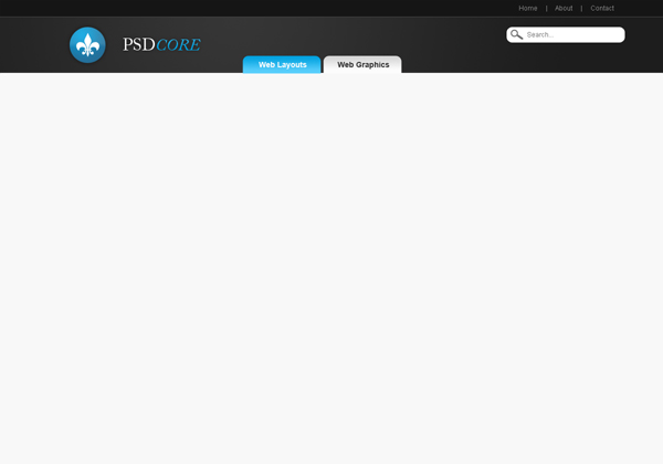
Now you can either repeat the process again a couple of times for the other buttons or just duplicate the layers and move them across (the short cut to duplicate a layer is Ctrl + J).
Step 9
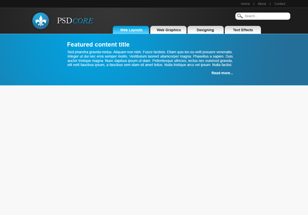
We are now going to be adding a featured content section – so it needs a background that stands out. Create a new layer and make a selection of 1200 by 200 pixels – again with a one pixel gap. Fill this selection with a radial gradient using the two colours #02a2e0 and #246f99.
Step 10
Apply a stroke to this featured content background. You can adjust layer styles for a layer by right clicking it (in the layers window) and going blending options. This gives it a little highlight which makes the background stand out that little bit more.
Step 11
Add in some text for the featured content area. Go grab some dummy text from lipsum.com if you do not have anything to stick there yet just to make it look more complete. The font is again Arial and white.
Step 12
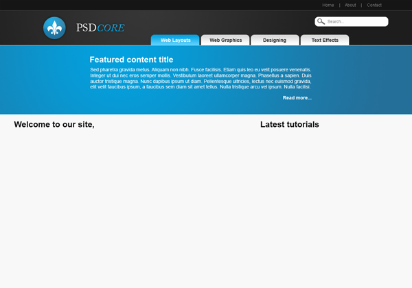
Now that we have finshed the header we can begin on the content. Add a couple of bold titles using the colour #151515.
Step 13
On a new layer make a selection using the rectangular marquee tool a couple of pixels high under each title and fill with the colour #d7d7d7.

Step 14
Add in some dummy text and images. The font is Arial and colour #464646.
Step 15
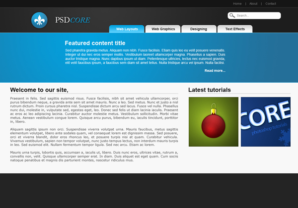
Our last task is the footer, on a new layer make a selection 1200 pixels wide and 140 pixels high at the bottom of the document and fill with the colour #242424.
Step 16
Apply this stroke to the footer.
Step 17
Last of all, chuck in some copyright details and links to your pages. The font here is Arial, and the colours are white and #5a5a5a. Now continue this tutorial by coding it up into css & html in this tutorial. If you are looking for a way to display your web layout, Network Solutions offers domain registration services as well as hosting for website owners. Check them out when you’re ready to start a website for your own business or organization.

very good web design tutorial
hi you !, nice tutorial. But looks likely silent users :) usefull design :))
thankz…very nice..i hope you will create more.
it help me a lot…God bless..
Thanks for the comments, and there are more to come for sure!
James….design is simple and elegant with nice colors…good work
my outcome
http://filesend.it/files/1257_qdmm4/Untitled-1.png
Thanks for the comments, your outcome looks good mostwanted :)
great tutorial
Great!!! thanks mate this is right what I need… :))
No problem, thanks for your comment.
On Step 1
“Fill the background with the colour #f7f7f.”
is it suppose to be “Fill the background with the colour #f7f7ff.” ? i tried your tutorial it gave me dirty green. hehe =)
It is supposed to be a dirty (not quite) white not green preferably :P I must of left off the trailing 7 in the number so it’s actually #f7f7f7 (I’ve adjusted the tutorial now).
Hey James thanks for the tutorial i managed to code mine up into a working blogger template it looks really cool im just finding thos ie bugs again
Thanks coder, yes IE is a pain to code for, it will be good when IE8 comes out and hopefully uses the correct codes to display pages like they should be.
This is great, and thanks for sharing this info. But if I could only get the darn thing to delete in step 8 I would be on my way. when the that portion of the background is delete only the white are goes, (which leaves it looking like checker boxes), the whole button remains.
Oh well, I rasterized the layer and it worked
@Houdini: yes you can either use the shape tool and the rasterize it or right click > make selection.
Easy! Simple! and Awesome!
How would you go about coding this sort of site in dreamweaver? Like with the buttons which you have created, they are only really an image in essence?
When I have it done in HTML, I’ll probably put a link here. You can either make each button a separate image and use Dreamweavers rollover image to change it on mouseover, this allows for special fonts and glowing and shadows. You could also make a table and put each button in there, on on each page, set that button as “current_tab” class or something of the sort. This class will override the default background image and use the light up one instead. You can use :hover in CSS to change the button on mouseover also.
Thanks Zieux.
@d^: One way is to have the image as the background of the button and have the text on that. Here’s the tutorial on how I did it.
Nice tutorial, thx
One question. How do come up with the 2 (radial, gradient) colors and the stroke color.
For the blues and blacks at the top.
Is there a specific color picker combination or something. Because the possibilities are endless and these blend very well together.
Thx. Pat.
Thanks Pat. To fill a selection with a radial gradient, first select the gradient tool and set it to radial (at the top of Photoshop there are a few different settings for the gradient tool). Now set your foreground and background colours to #02a2e0 and #246f99 (respectively). Left click on the left half of the selection and drag across to the right side and release.
To add a stroke colour go Layer > Layer Styles > Stroke and enter in the settings as per the tutorial.
I will be making some basic/fundamental tutorials to teach people how to create gradients etc in the future.
Hi James Thanks for your reply.
But what i mean is:
Why these two colors #02a2e0 and #246f99 and then the 3d color the stroke color.
How did you pick them. ?
Because there are thousands blues and blacks to choose from.
Do you first select one color and then find shades with it to match that color. Or do you use a color wheel.
Let’s say i’d like to make the blue top area , purple. How to find the RIGHT 3 colors to blend.
I’m good with programming, but horrible with colors. Thx.
Oh, I use the Photoshop colour picker and first pull the arrows on either side of the rainbow column in the middle to the colour I want to use. Then on the larger left coloured box I click where I want the colour to look for the first colour. Then move up towards white but not very far to have a lighter shade, and then further for a highlight. Make sure ‘H’ is selected on the right hand side of the colour picker.
I’ll probably make a tutorial on how to choose colours (although I find it hard to think of colour combinations too – so I’ll need to do some research ;).
thx
How would you go about coding this sort of site in dreamweaver? Like with the buttons which you have created, they are only really an image in essence?
I really didn’t get it!!! Please help me!!!
@ME_ME: You can follow the coding side (in dreamweaver with html/css) at http://www.psdcore.com/premium/modern-web-20-web-layout-code/
Thanks
Great tutorial! There needs to be more of these, the basics of Web 2.0 layouts. Everyone makes tutorials for the most difficult techniques, and what I really need to learn are layouts like this. Much more useful for my job.
Thanx!
Great Tutorial.
Great tutorial, Thanks
Cool tutorial. Well presented
It’s a good tutorial – except for one problem. All this really is about is designing a mockup. On top of that, following this you end up with a design that copies about 20% of all websites on the web. Instead of showing how to do a particular mockup, why not describe the effects?
Thanks for the commments, and @Teonnyn: I’ll keep that in mind for my next web layout tutorial :)
outstanding and thank you very very much
WoW thats good and thanks for the commments and its Great Tutorial thanks
Thanks for this nice tut
that was simply awesome i must try this tutorial.
hey i’m really new at photoshop and i wanted to know how did you make those lines in between the tiny texts? where it says Home About Contact.
That is just a character on the keyboard “|” – you can type this by holding the shift key and clicking \ on your keyboard.
Hi!
This is a great tutorial.
I would like to translate it for Polish GIMP Forum http://www.gimpuj.info . I will be happy if I get a permission.
Thanks, and yes you are welcome to translate the tutorial to Polish for your forum, providing you link back to the original tutorial and do not copy any of it in English.
Hi!
I just love it :)
So cool, thanks for sharing.
Hmm, if you won’t mind could you tell me which font you use for your Post titles, Add a Comment, etc.
Thanks!
Thanks, the font for my headings are Myriad Pro which is pre-installed on Windows I believe. If you aren’t seeing that, then you’ll be looking at Helvetica or Arial, which of course you’d know what fonts they are so it’s probably the former :)
Excellent tutorials James!I can’t wait to see more:)
Good One.Thanks.Here’s my result.
http://www.ynmcreations.netii.net
Thank YOU SO much for this. I really love learning how other designers make cool templates, and with great tutorials like this, it is both possible – and free.
Thanks for sharing your knowledge with us. Much appreciated.
I agree with Pat. I’m sorry, but its not enough to make a “tutorial” showing exactly what you did to create your theme. That’s a walk-through. A tutorial should show more generally what to do, taking yours as the example.
For example, rather than asking your reader to take your exact colors, and then make a “simple” gradient,perhaps instead describe the criteria by which you made two complimentary colors, and describe what affects you can achieve with different gradients.
Thanks for the comment optifex, I’ll keep that in mind for future tutorials. But hopefully people will learn by just making something too :)
http://sixpop.com/files/504/2009-06-22%20-%20TestLayout%20-%20tweak%20nav.jpg
There’s my version, please check out my site as well, I’ll probably give you a feature there soon.
Thanks for sharing your outcome Stefan, it looks good :)
Oh, sorry for the double comment, I also submitted it on deviantart, please email me if you wish for me to remove it!
http://sdrakulich.deviantart.com/art/Simple-Web-2-0-Portfolio-126873226
Once again, thanks for the help. It’s really appreciated, loved the tut!
can you tell at “welcome to our site”me please how you align the text in center? i can’t find it.
To align text, using the text tool select the text layer and at the top of Photoshop there are the four alignments available (along with other text settings). Alternatively go Window > Fonts or Paragraphs and there’s the same options and a couple more.
erm, you think you could recommend the size of font,?
The small font size is 13 and 14 pt, heading is 24 pt and logo 30 pt. Usually it’s best just to experiment until you get sizes that you think fit into the design (sometimes it’s appropriate to have a larger type than small and vice versa depending on the look you’re going for).
Hi, great tutorial but im stuck at step 8, I am a beginner in photoshop and I dont understand how I am going to do at:
Select the area of the background behind the logo (Ctrl + Click the layer’s icon) and invert selection (Ctrl + Shift + I) and delete it (delete key on your keyboard). This leaves just the top part of the button – the part we want
because when I try the ctrl + click the layers icon the message come up “Could not select a layer because the point you clicked on is not inside the vector mask of a visible layer.” plz help me
Try selecting the layer first and then ctrl + click the layer’s icon (if you have a vector mask selected then you’ll get that error you mentioned).
Sorry ny first question was stupid but I got another newbie question who I really need a answer on and it’s how do I select the area of the beckground att step 8? I have tried really mutch now but cant make it. Hope you reply
In the layers window (list of all the layers), there are the name of the layer on the right hand side and a little icon/image of the layer on the left. While holding the control button on your keyboard, left click that icon.
Ok thank you now I now how I select the background, but I hope this will be the final question because when I have select the background and then do the invert selection nothing happend when I delete it.
But I have noticed that to the right on the background layer is it a lock and it stand “Indicates layer is partially locked.” Can that be the reason why it dont work? and if it is hove do I take it away?
Try unlocking the layer, and if it still fails right click the layer and go Rasterize Layer.
Thank you, I’ve always wondered what is the colour of white background I see on many website, now I know (#f7f7f7.
You could also bring up the Colour Picker and drag from the white area until you find a nice shade of white that you like :)
hey..when you code this into html/css, how would you make it look the same on smaller monitor screens…
I normally use the 960 grid…just wondering how you would fit this one ..
I code my designs from scratch each time and the header/footer expands to fit larger screens (1920px, 2560px etc) and fits snug for normal sized screens. If you want you can design it with a smaller width if you want it to fit on small screens (800px), or make it fluid (expand / contract). There’s a tutorial on how I coded it here.
At step 8 I try using the gradient tool to fill in the shape but a error message comes up saying “content of the layer is not directly editable”
Will this affect the second part of step 8: using the inverse tool. I can’t seem to get that to work either. It keeps changing color and does not delete the bottom part of the button.
great design
thanks
Excellent tutorial!! Very helpfull!!
Thanks!
nice one keep up the good work
Sorry for the stupid question but I’m a photoshop beginner.
step 8 doesn’t work – “Select the area of the background behind the logo (Ctrl + Click the layer’s icon) and invert selection (Ctrl + Shift + I) and delete it (delete key on your keyboard)”
Can you give me more detail ? my blue tab is selected and I Cmd + Click the layer of the white background made in step 1, select the menu select/inverse and delete it but bottom part is still there. :-(
Thanks
Hi there.Loved the tutorial, thank you so much for sharing with us. Enjoyed it so much I decided to purchase your premium membership so that I could follow the coding tutorial but have had no response with the username and password required to login. Really keen to keep going with this so if someone could please get back to me.Thanks
@Christophe
I found I had to rasterize the layer before being able to inverse selection and delete :)
Nice guide, i followed a bit. To step 12, then i did it on my own. Cuz i wanted a portfolio.
My outcome:
http://i51.tinypic.com/dh9zmg.png
[i]Sry for my English[/i]
i have liked your tutorials keep it up. thanks
Plese suggest a good tutorial to convert this psd to XHTML- CSS template…
Please consider a tutorial on that topic.
I have created a tutorial to convert this design to an HTML/CSS template here.
Hi,
I cannot delete extra part of navigation by selecting layer 2 which contain logo background.
I did this: after making rounded button, ctrl + clcik on layer – > inverse -> click layer 2 – > delete …… nothing happened.
can u plz explain little more.
Hi,
What should be the general layout size in photoshop while designing for web 2.0
These layouts are very inspirational. I have bookmarked this page for future use thanks.
Magnificent web site. Plenty of helpful information here.
I am sending it to a few buddies ans also sharing in delicious.
And of course, thank you on your effort!
G’day, that was a great post! Loots of good suggestions, I am thankful that I stumbled
upon it.
I am going to favorite your page! :-)